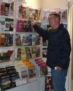
 We put the question: “What makes a successful leaflet or brochure?” to members of LinkedIn - an online network of more than 30 million experienced business people from around the world.
"Leaflets should encourage people to visit your attraction, region or event. To be successful, the leaflet should have the right look and contain appropriate information. What, in your experience, encourages people to pick up a brochure and take it home to share with others? Is there a 'perfect' leaflet design?"
We submitted the question just under a month ago and were delighted by the sheer number and variety of responses from marketing experts, graphic designers, tourism industry insiders and others with a professional interest in promotional print.
Paul Scanlon, the Chairman and owner of CDP Print Management, raises a number of practical issues. He points out that leaflets and brochures are “two separate marketing tools, both… zero rated for VAT purposes”. He also warns businesses to “beware” of “environmental issues in design and production”.
“Simple, Clear and Memorable!” These three words make up the dictum of graphic designer, Don Wright. Whereas, “Entice, Educate, Enthuse, Entertain, Excite” is the mantra of marketing consultant, Neil Logan. The Owner and Professional Abstract Stone Sculptor of WSG Gallery, Carl Wright, says that one should always “look at who is displaying brochures and what other brochures are going shoulder to shoulder with [your own]”.
Boyd Butler, the Consultant Development Director at KAM Sports International, believes you should “ask your visitors what they want to see in a brochure” and also ensure that your leaflets are “distributed in the right place”. Very true, Boyd – and of course, this is why we play such an important role with the finished product.
Our favourite response, however, is from Nick Booker, Director of the visitor attraction and leisure consultancy, Attract Marketing Ltd. He very sensibly points out that leaflets should be the “right size to fit in [the] stands”. While this may seem obvious, it’s surprising how often we are presented with oddly shaped and sized leaflets, which are either too tall or too wide to fit into any of our standard holders without being bent over or folded in two. He also highlights issues such as adding the name of the attraction “at the top so can be seen in stands” and getting the branding right.
Nick’s answer is well worth reading in its entirety, as are the many other excellent suggestions. The question has now been closed at LinkedIn but you are very welcome to continue posting your thoughts here.
1 comment:
A very useful blog post !
After spending 15 years in Tourism I can honestly say that the most important factor is the weight of the paper.
A thin paper falls forward on display, is then unreadable, looks untidy, and falls on the floor.
Use heavy paper or card.
Secondly make your title eye catching at the top where it will be visible.
Remember other leaflets will be stacked in front of it at lower heights.
Thirdly make it easy to find opening times, dates, contact details. A lot of time is wasted looking for them. I think the very start or the very end is the best place. Anywhere else and they get ignored or lost.
Fourthly - Don't use small fonts - 10-12 point is good for small leaflets - and do use a high contrast print- black on white or yellow is the most visible.
Remember the huge population who need reading glasses and didn't bring them with them.
Post a Comment